Purpose
The purpose of studying the pond is “to understand if the pond is healthy or not by measuring biodiversity”(Alan McIntyre). It is important to study the pond because the recent addition of the artificial turf fields could disrupt the biotic and abiotic interdependence within the pond. As Alan stated, “Artificial turf may create an artificial die-off” (Alan McIntyre). Also, the data collected will be important because the pond is being dredged in December, and the data from this year can be compared to the data from next year and determine whether or not dredging improved pond health. On the dates October 19th, October 23rd, and October 25th, E Block AP Environmental science investigated and gathered data on the Proctor Pond.
Hypothesis
The pond should be healthy with significant biodiversity because it is located in a protected area away from anything environmentally hazardous or threatening. Even though the turf fields are within proximity, drains divert water from the turf away from the pond.
Materials:
- 1 Thermometer to test both the air and water temperature
- 1 D-shaped net for collecting biotic samples
- 1 iPhone 7 for taking pictures
- 1 notebook for recording biotic and abiotic data, as well as making general observations about the site
- 1 pencil to take notes
- 1 Beaufort scale to identify the wind speed based on observations
- 2 test tubes, each with 5 mL and 10 mL markings on them
- 1 LaMotte phosphorus testing kit
- 1 LaMotte pH testing kit
- 1 LaMotte turbidity testing kit
- 1 large bin for collecting samples
- 1 small container with three compartments for identifying specific organisms
- 1 magnifying glass
- 1 pipette
- 1 Spoon with holes in it
- 1 biotic identification sheet for identifying indicator species, somewhat tolerant species, and very tolerant species.

Photo by Sarah Ferdinand
Sampling Methods:
Each day, Will Luskey, Joey Briggs, and I collected data using the same method. First, we collected biotic samples and then abiotic samples. Below is a procedure for collecting both biotic and abiotic samples.
Biotic Sampling:
- Pick up the D-shaped net, the large bin, and the small container and bring them over to the edge of the pond.
- While standing at the edge of the pond, place the D-shaped net into the water, and make sure it is touching the bottom.
- Next, move the net to the right, and then back to the left (this is called sweep netting) three times. At this point, the net should have an inch or two of abiotic material in it.
- Next, place the contents of the net into the large bin, and then fill the large bin halfway with water from the pond. Remove the large pieces of organic matter which will impede your vision (leaves or sticks), but leave the organic material that will not impede your vision (dead grasses) as they could be a home for an organism.
- Now, begin to sift through the contents of the bin and place any living organisms into the smaller container, where they can be identified. Begin to identify these organisms using the biotic identification sheet. Record the quantity of each species found in a notebook. (NOTE: WE DID THIS INSIDE ON OCTOBER 25TH SINCE IT WAS TOO COLD OUTSIDE)
- Repeat steps 1-5 as time permits


Abiotic Sampling:
- Air temperature:
- Hold the thermometer with an outstretched arm, and make sure the probe is not touching the ground. Observe the thermometer reading, and once the reading stays at one value for 60 seconds, record the air temperature in a notebook.
- Water Temperature:
- Place the probe into the water, ensuring it is completely submerged. Observe the thermometer reading, and once the reading remains at one value for 60 seconds, record the water temperature in a notebook.
- Phosphate:
- Fill one of the test tubes with pond water up to the 5mL line.
- Take one of the tablets from the phosphate test kit and place it in the test tube, and shake the test tube until the tablet is completely dissolved.
- Wait five minutes, and then compare the color of the solution in the test tube to the colors on the chart to get a numerical value (1-4) for the phosphate level.


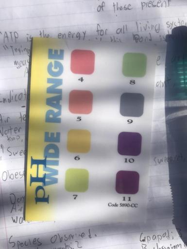
- pH:
- Fill one of the test tubes with pond water up to the 10mL line.
- Take one of the tablets from the pH test kit and place it in the test tube, and shake the test tube until the tablet is completely dissolved.
- Compare the color of the solution to the colors on the chart to get a numerical value (1-11) for the pH.

- Wind Speed:
- Examine the Beaufort scale chart, and compare the surroundings to the description on the chart to get a numerical value (1-12) for the approximate speed of the wind.
Original photo by Ben Charleston

- Turbidity:
- Fill the test tube from the turbidity testing kit to the specified amount.
- Place the test tube over the center circle and look through the test tube, at the circle.
- Approximate the turbidity (0-100 JTU) by comparing the appearance of the circle beneath the test tube to the surrounding circles, with corresponding numerical values.


- Weather:
- Simply pay attention to the weather for the entirety of the study
- Classify each day as sunny, partly cloudy, cloudy, rainy, or snowy. (Also, note if there is extremely high wind)
Narrative on Sites, Observations, and Events
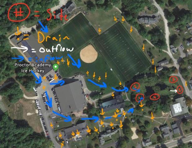
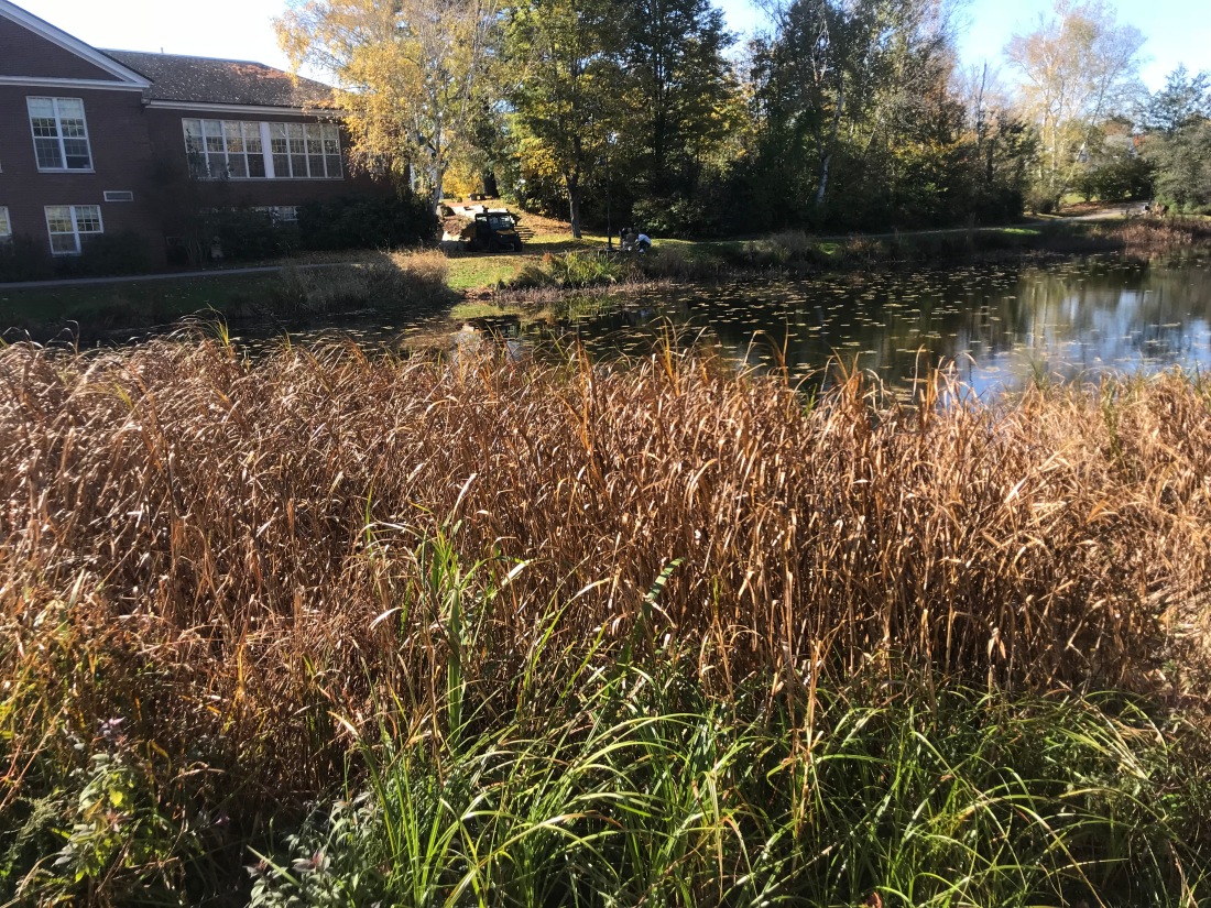
On Friday, October 12th, 2018, the class was split up into five groups containing three to four students in each group. My group of three people was assigned data collection from site three. Site three is in the back right corner of the pond, as seen in the map below. Also, there are two inflows to the pond at sites one and two, and one outflow at site five. The water in the pond comes from all the drains around campus (see map below) going all the way back to the hockey rink. We studied our site at different times of the day, on each day of study. On October 19th, the site was studied from 10:55 AM to 11:25 AM, On October 23rd, the site was studied from 11:45 AM to 12:30 PM, and on October 25th, the site was studied from 10:40 AM to 11:20 AM. On the last two days of the study, October 23rd and 25th, the wind was light, and these days earned a one and two, respectively, on the Beaufort scale. This approximates to winds speeds of 1-3 mph on October 23rd and 4-7 mph on October 25th. However, on the first day of the study, October 19th, the wind was much stronger, and was evaluated at a 5 on the Beaufort scale. This is significantly stronger than the other two days, and approximates to 19-24 mph. Also, there was a major rain event between October 19th and October 23rd, which could have brought sediment into the pond and affected the data. Site three is unique because it is the only site on the pond which has a significant amount of grass. This grass is important because it protects the surrounding area from wind and debris. However, as the study went on, I began to notice that the grass was dying, and by October 25th, the grass was still standing, but was 100% brown with no traces of green. This rapid death of the grass could be due to the temperature and weather on the three days which was 53.2°F and partly cloudy on the 19th, 46.6°F and cloudy on the 23rd, and 39.5°F and partly on the 25th. Despite the cold temperatures and overcast skies, the quantity of organisms observed increased each day we sampled. On the first day ten organisms were observed representing four different species, on the second day 44 organisms representing 9 species were recorded, and on the third day 39 organisms representing 6 species were observed.


Data:
TO SEE OUR RAW DATA CLICK HERE
Annual Water Temperature: Data table made by Ben Charleston, inspired by Sarah Ferdinand
Year Water Temperature (°F):
Year Water Temperature (°F)
| 2007 | 52.1 |
| 2008 | 52.1 |
| 2009 | N/A |
| 2010 | 53.1 |
| 2011 | N/A |
| 2012 | 54.3 |
| 2013 | 55.6 |
| 2014 | 54.4 |
| 2015 | 50.5 |
| 2016 | 47 |
| 2017 | 56.6 |
| 2018 | 44.84 |
| Overall Average | 52.054 |
Dissolved Oxygen (mg/L) Over Time: Data table made by Ben Charleston, inspired by Sarah Ferdinand
| Year | Average (mg/L) |
| 2007 | 2.5 |
| 2008 | 1.67 |
| 2009 | N/A |
| 2010 | 1.6 |
| 2011 | N/A |
| 2012 | 1.5 |
| 2013 | N/A |
| 2014 | 6.2-7.9 |
| 2015 | 6.65 |
| 2016 | 8.3 |
| 2017 | 1.39 |
| 2018 | N/A |

This data set demonstrates that the water temperature this year is the coldest since 2007, 7.214°F below the average and 2.16°F colder than the next coldest year. The average air temperature during the study was also cold, measured at 45.9°F. The temperature of both the air and the water are important factors to consider. Colder water temperatures allow the water to hold more dissolved oxygen. Although the dissolved oxygen levels were not measured this year (due to technical failure of the DO measuring device), I would hypothesize that the DO levels this year are the highest of any year. This hypothesis is supported by the data because the next coldest year (2016) when the temperature was 47°F, the dissolved oxygen content was 8.3mg/L, higher than any other year. Also, the second coldest year, (2015) when it was 50.4°F, the dissolved oxygen content was 6.65mg/L, the second or third highest ever recorded. If this trend continues, than it is likely that this year had a dissolved oxygen content of at least 8.3mg/L. While dissolved oxygen is an important factor, it is clear that DO levels fluctuate more from temperature changes, than actual changes in the ecosystem’s health. For example, the study in 2007, when the temperature was 52.1°F, measured DO levels of 2.5mg/L, the fifth lowest ever, but a diversity index of 19.3 (See the data table below), the highest ever. This proves that while DO levels may represent changes in the ecosystem, scientists must be careful because DO levels are also a reflection of the temperature during the study.
Also, the cold air and water temperatures were a variable which prevented us from keeping our hands in the water for a long time. This could have prevented us from seeing some organisms which could possibly alter the data.
pH Over Time: Data table made by Ben Charleston, inspired by Sarah Ferdinand
| Year | Average |
| 2007 | 6.77 |
| 2008 | 7.03 |
| 2009 | NA |
| 2010 | 6.88 |
| 2011 | NA |
| 2012 | 6.63 |
| 2013 | 7.25 |
| 2014 | 6.15 |
| 2015 | 6.42 |
| 2016 | 6.75 |
| 2017 | 6.68 |
| 2018 | 6.73 |
| Overall Average | 6.73 |
Mayfly Nymphs Over Time: Data Table Made By Ben Charleston
| Year | Number of Mayfly Nymphs observed |
| 2007 | 11 |
| 2008 | 5 |
| 2009 | N/A |
| 2010 | 11 |
| 2011 | N/A |
| 2012 | 9 |
| 2013 | 30 |
| 2014 | 72 |
| 2015 | 7 |
| 2016 | 27 |
| 2017 | 24 |
| 2018 | 15 |
| Overall Average | 21.1 |
Stonefly Nymphs Over Time: Data Table Made By Ben Charleston
| Year | Number of Stonefly Nymphs observed |
| 2007 | 5 |
| 2008 | 2 |
| 2009 | N/A |
| 2010 | 1 |
| 2011 | N/A |
| 2012 | 1 |
| 2013 | 22 |
| 2014 | 6 |
| 2015 | 2 |
| 2016 | 0 |
| 2017 | 6 |
| 2018 | 3 |
| Overall Average | 4.8 |

This data is useful because Mayfly Nymphs and Stonefly Nymphs are indicator species, which means they require a very specific pH to survive. As Alan said, “Indicator species will not tolerate a pH less than 6.5 or greater than 7.5, or bad water quality” (Alan McIntyre). This proves that if there is an abundance of indicator species, the body of water is in good health. Throughout the years the pond has been studied, the year with the highest amount of stonefly nymphs and mayfly nymphs was 2013 when the pH was 7.25, the closest ever to neutral (7). In 2013, there were 22 stonefly nymphs and 30 mayfly nymphs observed. The almost neutral pH, and the abundance of mayfly nymphs and stonefly nymphs observed shows that the pond was in good health in 2013. One exception to this trend is the number of mayfly nymphs observed in 2014. In 2014 the pH was 6.15, too low for an abundance of indicator species, yet the class observed 72 mayflies. However, Alan explained that during this year, “There was one student who was exceptional at biotic sampling, and collected the vast majority of the organisms. I think this student had previous experience studying a body of water beforehand” (Alan McIntyre). Therefore, the reason for the high amount of mayfly nymphs in 2014 is not because the water quality was good, but rather because one student had experience with sampling, making this data hard to compare to other years.
Also, due to the cold temperatures, my group’s ability to identify mayflies and other smaller species was impaired. For example, on the third day, it was so cold that we were forced to go inside to do our biotic sampling, and on this day (October 25th) we found 7 mayfly nymphs compared to only 4 mayfly nymphs on the first two days combined. This supports the idea that if scientists are distracted (cold weather), the data can be impacted greatly.
Diversity Index: Data table by Ben Charleston, inspired by Sarah Ferdinand
| Year | Average |
| 2007 | 19.3 |
| 2008 | 15.4 |
| 2009 | N/A |
| 2010 | 11.7 |
| 2011 | N/A |
| 2012 | 7.26 |
| 2013 | 12.2 |
| 2014 | 7.1 |
| 2015 | 6.3 |
| 2016 | 6.3 |
| 2017 | 7.4 |
| 2018 | 7.09 |
| Overall Average | 10 |

This diversity index was calculated using the Simpson’s Diversity Index Formula:
D=N(N-1)/∑n(n-1)
In this equation, N is the total number of individuals, and n is the number of individuals observed from one species. This formula is designed to account for the richness and evenness of a species. This calculation is useful because the higher the number, the more species present. For example, in 2007, which recorded the highest diversity index ever, there were 25 different species observed. Also, in 2008, which recorded the second highest diversity index ever, there were 24 species present. However, in 2015 and 2016, the two lowest diversity indices ever, there were only 19 and 22 species observed. While this may seem like a lot, in 2015 only 10 of the species had more than 5 individuals observed, and in 2016 only 7 of the species had more than 5 individuals observed. Therefore, biodiversity isn’t only based on the pure number of species present, but also the how many individuals of each species are present.
Water Quality Pollution Index: Data table made by Ben Charleston, inspired by Sarah Ferdinand
| Year | Average |
| 2007 | 59 |
| 2008 | 48 |
| 2009 | N/A |
| 2010 | 44.3 |
| 2011 | N/A |
| 2012 | 41.6 |
| 2013 | 66.4 |
| 2014 | 63.5 |
| 2015 | 37.9 |
| 2016 | 34.4 |
| 2017 | 48.1 |
| 2018 | 34.3 |
| Overall Average | 47.75 |
The water quality pollution index was calculated by labeling each species as dominant (>100 organisms), common (10-99 organisms), and rare (1-9 organisms). After labeling each species, the species were split up into three categories with varying levels of pollution toleration. The species with low levels of pollution toleration, indicator species, were given more weight than species who cold tolerate higher levels of pollution. The values for each of the groups were then added up to get the water quality score. A water quality score of more than 40 signifies excellent water quality, a score of 30-40 signifies good water quality, a score of 15-30 signifies fair water quality, and a score less than 15 signifies poor water quality. Our water quality score was 34.3, meaning the pond water quality is good. This is the lowest water quality score ever recorded. However, the low water quality may not indicate that the pond is totally unhealthy, as the temperature could have affected this data. In 2016, the second coldest year ever recorded, the water quality pollution index was 34.4, only 0.1 higher than ours. Also, in 2017, the warmest year ever, the water pollution index was 48.1 which is significantly higher than this year, as well as the two previous years. Therefore, water temperature may decrease the water quality pollution index for two possible reasons: colder water decreases organisms’ activity, making them harder to catch, or the colder air and water temperatures make the scientists so uncomfortable that it becomes impossible to accurately identify all the organisms in the sample.
Turbidity (JTU): Data table by Ben Charleston, inspired by Sarah Ferdinand
| Year | Average (JTU) |
|
2007 |
0.2 |
|
2008 |
0.2 |
|
2009 |
N/A |
|
2010 |
2 |
|
2011 |
N/A |
|
2012 |
0 |
|
2013 |
20 |
|
2014 |
4.85 |
|
2015 |
6.87 |
|
2016 |
5.3 |
|
2017 |
13.3 |
|
2018 |
14.32 |
| Overall Average |
6.704 |
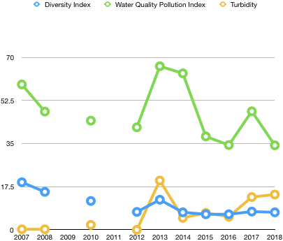
This data and graph regarding the turbidity of the pond is useful because turbidity is indicative of how much sediment is in the water. While sediment can be harmful to a pond, it also brings in nutrients that promote population growth. For example, in 2013, the average turbidity was 20 JTU, the highest ever recorded. The high turbidity in 2013 can be attributed to the installation of the turf fields, which do not hold the sediment as well as the previous grass fields. However, in 2013, the in the diversity index went up from 7.26 in 2012 to 12.2 in 2013, and the water quality pollution index went up from 41.6 in 2012 to 66.4 in 2013. This trend is observed again in 2017 when the average turbidity was 13.3 JTU, and the diversity index was 7.4, which is 1.1 higher than the previous two years. The water quality pollution index was 48.1, significantly higher than in 2015 and 2016, which recorded water pollution indices of 37.9 and 34.4, respectively. Therefore, as the turbidity increases, the biodiversity and water quality increase as well.
Although turbidity increase water quality and biodiversity, high levels of turbidity are not a good sign for the pond. Higher turbidity levels mean there is an excess amount of sediment entering the pond, which means the pond is slowly getting shallower. This shallowing trend is one of the reasons why Proctor decided to dredge the pond in December.
One variable for collecting the turbidity is some groups did it before sweep netting, after sweep netting, or from their sampling bin. Taking the turbidity after sweep netting or from the sampling bin could give levels of turbidity that are too high because the benthic (bottom) region of the site had already been disturbed, which could make the water murky. Taking a sample for this murky water would give a turbidity reading that is higher than the actual turbidity at the site.
Phosphate (PPM): Data table by Ben Charleston, inspired by Sarah Ferdinand
| Year | Average (PPM) |
|
2007 |
2.2 |
|
2008 |
4 |
|
2009 |
N/A |
|
2010 |
3.5 |
|
2011 |
N/A |
|
2012 |
0.425 |
|
2013 |
0.4 |
|
2014 |
1.05 |
|
2015 |
N/A |
|
2016 |
N/A |
|
2017 |
N/A |
|
2018 |
1.25 |
| Overall Average |
1.83 |

The phosphate levels of the pond indicate how much ATP (Cellular Energy) is being produced through respiration by organisms in the pond. In a healthy system, the phosphate levels should be low because organisms are utilizing all phosphate for ATP production. This is reflected in the data from the pond, and years with high phosphate levels typically had lower biodiversity. For example, from 2007-2008, phosphate levels increased from 2.2PPM to 4.0PPM, and the diversity index decreased from 19.3 to 15.4. Also, the study in 2013 recorded phosphate levels of 0.4PPM, the lowest ever, and the diversity index of this year was 12.2, up 4.94 from the previous year. Therefore, the overall trend is that as phosphate levels decrease, biodiversity increases. However, in 2012, phosphate levels were low, but biodiversity was also low. The low diversity index in 2012 was not due to a lack of species, as 24 different species were observed, but it is because there were a handful of species which dominated the others in terms of individuals that were observed. This domination could be due to the construction happening in 2012, which could have put sediment in the pond that contained nutrients which favored the growth of only a few species.
This year, one possible source of error my group had is that we only measured phosphate levels for one out of the three days because our class ran out of tablets. This struggle was shared by many other groups, and could have impacted our classes overall average phosphate levels. Another variable in our study is that the phosphate levels were qualitatively measured on a color scale, and the interpretation of the color that signifies a certain value could vary from group to group. For example, our group approximated the phosphate levels as 1.5 because the color was in between one and two, but some groups only used whole numbers. This difference in the collection of data from group to group could have altered the data significantly.
Conclusion:
Throughout the study of the pond, there were many data points, both abiotic and biotic, that were observed or calculated. The reason for collecting this data is to determine the healthiness of the pond. Based off this year’s data, I would say that the pond is in decent, but declining health. I say this because the turbidity this year was 14.32 JTU, the second highest ever recorded. This means that there is a lot of sediment flowing into the pond from various places such as parking lots and construction sites. All of this sediment is slowly filling in the pond, and, as Alan said, “the pond has gotten significantly shallower over the years” (Alan McIntyre) and “Without dredging, it would turn into a wetland” (Alan McIntyre). Also, turbidity shows how deep sunlight can reach into the pond. If the sunlight can only reach a few feet below the surface, that means the compensation point of the pond is higher, making the pond less productive. The compensation point is the point where the amount of oxygen produced through photosynthesis is equal to the amount of oxygen required to perform cellular respiration. Essentially, the compensation point is the depth where the pond becomes productive, and the deeper the compensation point, the more productive the pond. Therefore, the fact that the turbidity was so high this year means that the compensation point of the pond is most likely shallow, meaning the pond is probably less productive than in previous years. Another concerning data point is the number of mayfly nymphs and stonefly nymphs observed. This year there were 15 mayfly nymphs compared to 24 in 2017, and there were 3 stonefly nymphs this year, compared to 6 in 2017. Indicator species are valuable because they have very specific niches, meaning they have very specific needs in order to survive. Since indicator species have very specific niches, if they are present in abundance, typically, the water quality is excellent. This year we found a total of 15 mayfly nymphs and 3 stonefly nymphs, which is a very low number and shows that the pond is in declining health. Also, the water quality pollution index was 34.3, the worst ever recorded, suggesting the pond is on a downward trajectory. However, there are two data points which show the pond is in decent health, phosphate levels and the diversity index. This year the diversity index was 7.09. Although this number is lower than last year (7.4), it is higher than the diversity index in 2015 (6.3) and 2016 (6.3). The diversity index from this year shows that the pond has, at most, lost a little of its biodiversity from last year. Also, the phosphate levels this year were 1.25 PPM, the fourth lowest ever, although phosphate was not measured in 2009, 2010, 2015, 2016, or 2017. Low phosphate levels are a good sign because it means that there are enough organisms respiring in the pond using the available phosphate to produce ATP (Adenosine Triphosphate).
Based off all of the data points collected, I conclude that the pond is mainanting decent health, but the health will continue to decline if nothing is changed. However, with the dredging of the pond this winter, I believe that the pond will recover. I think next year, the study will conclude that the pond is unhealthy, but in the years after that, the study of the pond will conclude the pond is healthy and yield similar result to the study in 2007 and 2008.
Despite the declining health of the pond, some symbiotic relationships were observed. One of these symbiotic relationships is predation between predaceous diving beetles and tadpoles. In this relationship, the predaceous diving beetle preys on tadpole populations. In addition to symbiotic relationships, competition between species was also witnessed. Since the pond does not have an unlimited amount of resources, there is competition for food. Two species that regularly compete over food are mayfly nymphs and stonefly nymphs. This competition is called interspecific competition. This competitive relationship is supported by the data because there is only one year, 2013, when there were a lot of mayfly nymphs and stonefly nymphs.
Although extensive measures were taken to ensure the accuracy of our study, there were many variables and possible sources of error. Of these variables, the ones that affected our study the most was the temperature, our method of biotic sampling, and the fact that some of the abiotic tests can be altered by interpretation. The cold air temperature, measured at 45.9℉, made it painful to keep my hands in the water for more than one minute at a time. This could have caused us to overlook many organisms that we would have seen in warmer conditions. However, on October 25th it was so cold that we had to do our biotic sampling inside. Sampling inside allowed my group to focus better, and therefore we found more organisms. Also, as the study progressed, picking organisms out of the bin became easier and easier. This suggests that many organisms could have gone undiscovered and unaccounted for on the first day. Another major variable was the fact that the measurements for phosphate, pH, and turbidity were all derived by comparing the color of a solution (or a circle for turbidity) to a chart. This is a source of error because each person may interpret the color differently, which could skew the data for the whole class.
When Alan first told us we were going to study the Proctor Pond, I was excited. During my sophomore year, I did a history project on the pond, so I know all of its history, but I have always wanted to know about its current health. Albeit, I must admit I was a bit nervous because I had no previous experience with biotic sampling or identifying species. However, after the first day, I immediately became comfortable with and enjoyed testing both the abiotic and biotic factors at my site. I learned how to sweep net and sift through the contents of our net and locate most of the living organisms. However, this study was not always easy, as it was extremely cold, windy, and, at times, rainy. Although I was able to push through these unfavorable weather conditions, I would like to do this study again when I don’t have to stick my hands under my armpits every five minutes to warm up my hands. All things considered, this study was fun, and every time I walk by the Proctor Pond, instead of staring at my phone, I will think about all the mayfly nymphs, scuds, copepods, and other species lurking below the surface.
